Each year, we choose a few thoughtful updates for our rentals—projects that elevate the experience and help the homes feel fresh, comfortable, and a little more special over time.
One project we took on in 2026 was refreshing the sunroom in our Minneapolis short-term rental.
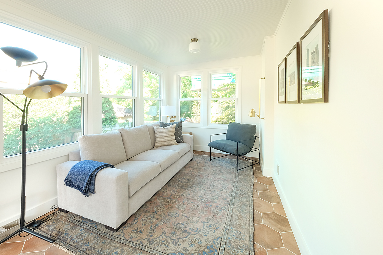
This space was originally renovated in 2023 as part of our initial budget remodel. At the time, we transformed it from a dated three-season porch (complete with turf carpeting) into a bright, heated and cooled four-season sunroom. We removed the paneling, insulated and drywalled the space, installed new windows and lighting, and added aged-look terracotta hex tile to complement the character of the house.
After all of that, we painted the walls white, furnished it simply, and lived with it for a few years.
But over time, it started to feel like the one room that hadn’t quite reached its potential.
I previously wrote about experimenting with AI to generate design mockups, and this sunroom became one of my first real tests of using it to guide a project.
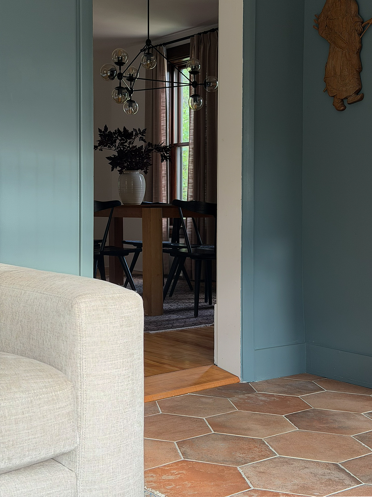
For this refresh, I knew I wanted more color. After what feels like a decade of white walls, I’ve become a little color obsessed lately. I pulled together inspiration images and generated a few concepts to explore different directions. Since colors never translate perfectly from screen to real life, I ordered a stack of Sampilize samples and tested them in the space. Farrow & Ball De Nimes quickly became the winner.
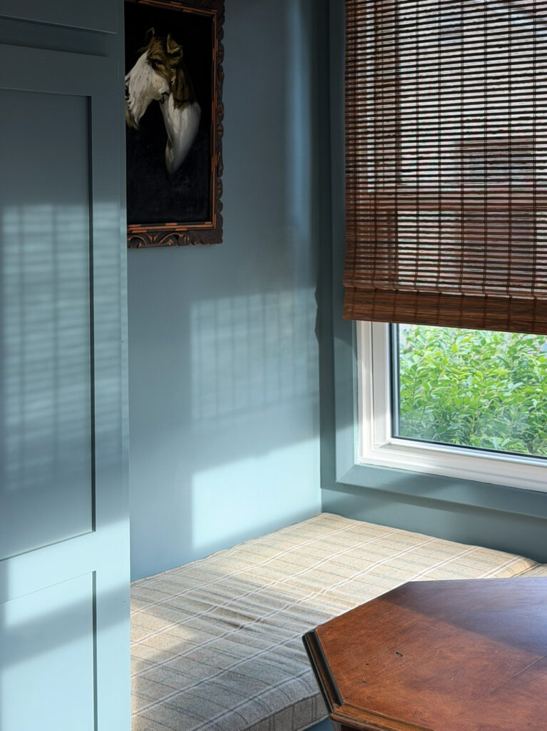
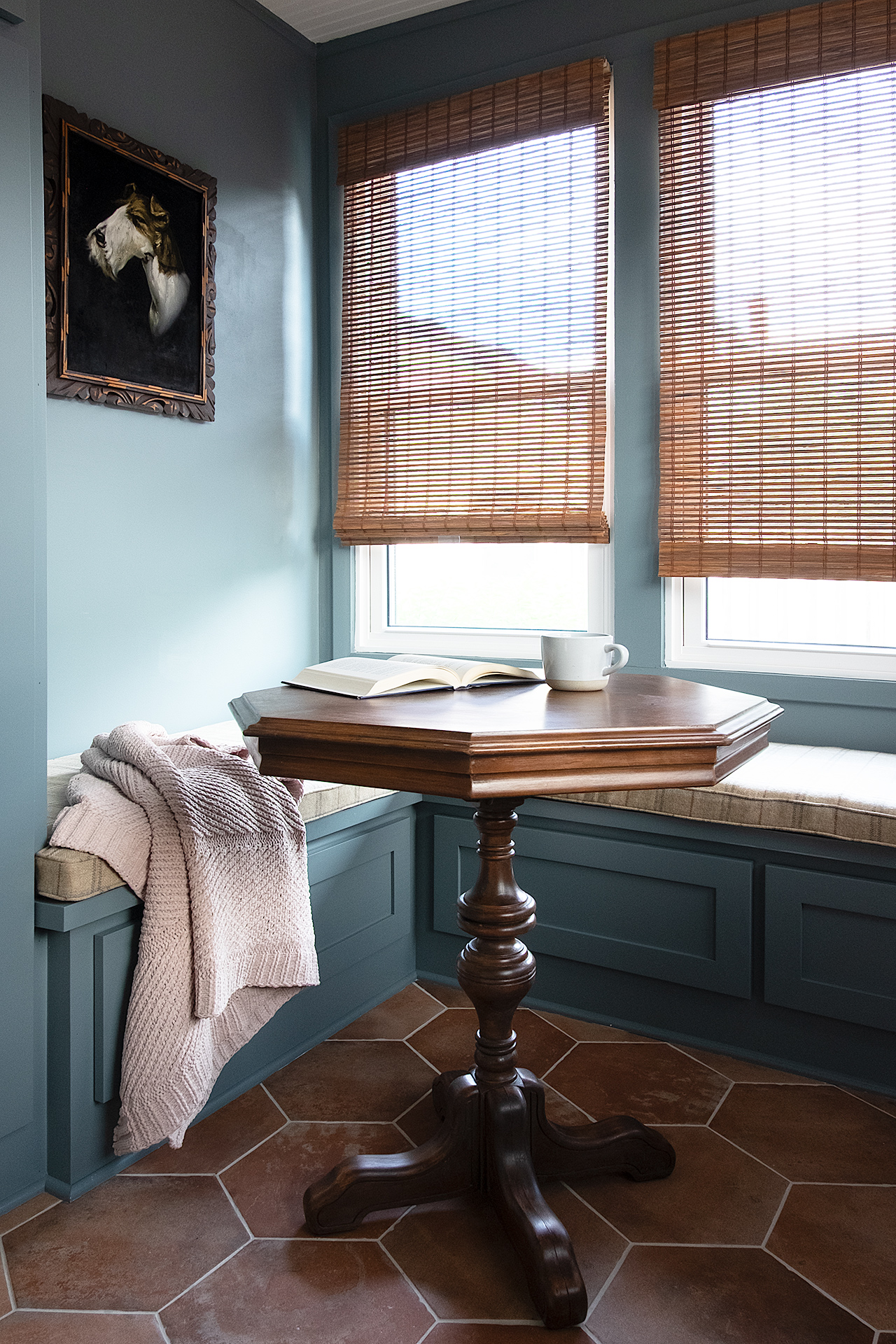
To create a more enveloping and cohesive feel, I painted both the walls and trim the same color and added custom built-ins to turn an underused corner (previously just a spot to hang coats) into a cozy nook with extra storage. For the cushions, eBay came through again—one of my favorite sources for affordable designer textiles—and I found a beautiful plaid wool fabric.
Because we were trying to stay thoughtful with the budget, I hunted for the dining table on Facebook Marketplace and found this lovely vintage piece. I stripped, sanded, and refinished it with antique walnut gel stain to warm it up and give it new life.
The final layer was simple: my favorite natural woven shades and decor gathered from other areas of the house. The nook has honestly become my favorite place in the house now, especially with the view out to the backyard.
I still want to add a pendant light over the table and swap out the sofa for a berry/ maroon colored one with a more traditional shape—but that can be next year’s project.
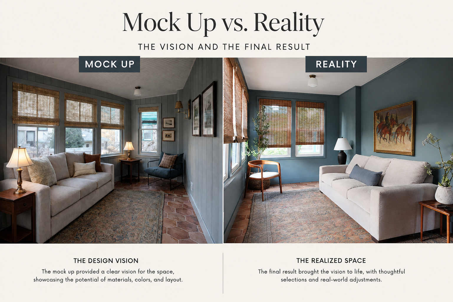
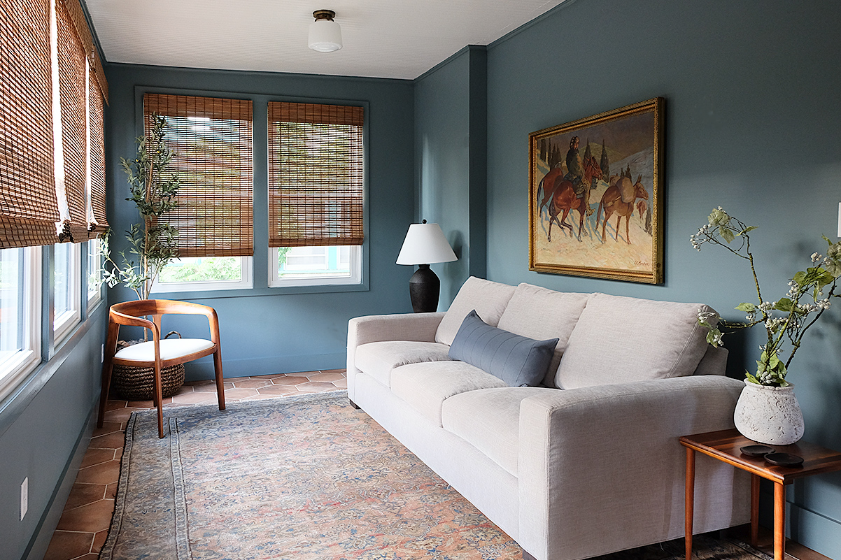
Looking back at the AI renderings now, what stands out to me isn’t that they predicted the final room—it’s that they gave me confidence to try something bolder.
The biggest takeaway from the mockups was realizing how much depth and character color could add to the space. After years of defaulting to white walls, seeing the room rendered in blue immediately made the existing version feel flat by comparison.
The final room didn’t end up matching the rendering exactly. I chose a different shade of blue, and interestingly, I found that the extra architectural detail the AI added—like the vertical paneling—wasn’t necessary at all. In the renderings, texture was doing a lot of the work. In real life, the paint color alone brought enough depth and warmth to make the room feel finished.
That ended up being my favorite lesson from the project: AI was useful for identifying the direction, but the final design still came from editing and simplifying.